Create HTML Form in Seconds

Posted by Muhammad Shiraz Kamboh Monday 28 May 2012 0 comments
Create Online Simple awesome HTML Form with easy 3 Steps


Click Here to 
Create PHP, HTML Form


How Give A Kid an evil Look

Posted by Muhammad Shiraz Kamboh Sunday 27 May 2012 0 comments

A. Open the photo
Two. Duplicate the original layer and call it "Eyes" (well, this is purely for convenience :)
Three. Change the blend mode (blend mode) of the new layer to Screen


Chapter 18 : CSS Pseudo Elements

Posted by Muhammad Shiraz Kamboh 0 comments
The Syntax
The syntax for pseudo elements is a bit different than that of regular CSS, but it’s real close. If you have already read chapter 11 then you are slightly ahead of the game.
selector:pseudo-element {property: value}
As you can see the only difference is that you place the pseudo element after the selector, and divide the 2 with a (:) colon.
Or you can assign a class to a pseudo element as follows

Chapter 17 : CSS Positioning

Posted by Muhammad Shiraz Kamboh 0 comments
Inherited: No

Position

The position property (as you may have guessed) changes how elements are positioned on your webpage.
position: value;

Chapter 16 : CSS Classification

Posted by Muhammad Shiraz Kamboh 0 comments
Inherited: No

Clear

You can control if an element allows floated elements to its sides with the clear property
clear: value;

Chapter 15 : CSS Width and Height Properties

Posted by Muhammad Shiraz Kamboh 0 comments
Inherited: No

Height

You can control the height of an element with the height property
height: value;

Chapter 14 : CSS Lists

Posted by Muhammad Shiraz Kamboh 0 comments
Inherited: Yes

List Style

You can control the appearance of ordered and unordered lists in one declaration with the list-style property
list-style: value value;

Chapter 13 : CSS Borders

Posted by Muhammad Shiraz Kamboh 0 comments
Inherited: No

Border

You can set the color, style and width of the borders around an element in one declaration by using the border property.
border: 1px solid #333333;

Chapter 12 : CSS Backgrounds

Posted by Muhammad Shiraz Kamboh 0 comments
Inherited: No

Background

You can style the background of an element in one declaration with the background property.
background: #ffffff url(path_to_image) top left no-repeat fixed;

Chapter 11 : CSS Anchors, Links and Pseudo Classes

Posted by Muhammad Shiraz Kamboh 0 comments
Below are the various ways you can use CSS to style links.
a:link {color: #009900;}
a:visited {color: #999999;}
a:hover {color: #333333;}
a:focus {color: #333333;}
a:active {color: #009900;}

Chapter 10 : CSS Font Properties

Posted by Muhammad Shiraz Kamboh 0 comments
Inherited: Yes

Font

The font property can set the style, weight, variant, size, line height and font:
  font: italic bold normal small/1.4em Verdana, sans-serif;
The above would set the text of an element to an italic style a bold weight a normal variant a relative size a line height of 1.4em and the font to Verdana or another sans-serif typeface.

Font-Family

You can set what font will be displayed in an element with thefont-family property.
There are 2 choices for values:

Chapter 9 : CSS Text Properties

Posted by Muhammad Shiraz Kamboh 0 comments
Inherited: Yes

Color

You can set the color of text with the following:
  color: value;
Possible values are
  • color name – example:(red, black…)
  • hexadecimal number – example:(#ff0000, #000000)
  • RGB color code – example:(rgb(255, 0, 0), rgb(0, 0, 0))

Chapter 8 : CSS Padding

Posted by Muhammad Shiraz Kamboh 0 comments
Inherited: No
Padding is the distance between the border of an (X)HTML element and the content within it.
Most of the rules for margins also apply to padding, except there is no “auto” value, and negative values cannot be declared for padding.
  padding-top: length percentage;
  padding-left: length percentage;
  padding-right: length percentage;
  padding-bottom: length percentage;

Chapter 7 : CSS Margins

Posted by Muhammad Shiraz Kamboh 0 comments
Inherited: No
As you may have guessed, the margin property declares the margin between an (X)HTML element and the elements around it. The margin property can be set for the top, left, right and bottom of an element. (see example below)
  margin-top: length percentage or auto;
  margin-left: length percentage or auto;
  margin-right: length percentage or auto;
  margin-bottom: length percentage or auto;

Chapter 6 : CSS Spans

Posted by Muhammad Shiraz Kamboh 0 comments
Spans are very similar to divisions except they are an inline element versus a block level element. No linebreak is created when a span is declared.
You can use the span tag to style certain areas of text, as shown in the following:
<span class=”italic”>This text is italic</span>
Then in my CSS file:
.italic{
  font-style: italic;
}

Chapter 5 : CSS Divisions

Posted by Muhammad Shiraz Kamboh 0 comments
Ok so you have finished the first 4 chapters in my series. You have learned the very basics of CSS, how the syntax works and a bit about classes and IDs. Now we are gonna take a quick break from CSS and focus on the (X)HTML side of using it.

Divsions

Divisions are a block level (X)HTML element used to define sections of an (X)HTML file. A division can contain all the parts that make up your website. Including additional divisions, spans, images, text and so on.

Chapter 4 : CSS IDs

Posted by Muhammad Shiraz Kamboh 0 comments
IDs are similar to classes, except once a specific id has been declared it cannot be used again within the same (X)HTML file.
I generally use IDs to style the layout elements of a page that will only be needed once, whereas I use classes to style text and such that may be declared multiple times.
The main container for this page is defined by the following.
<div id=”container”>
Everything within my document is inside this division.
</div>

Chapter 3 : CSS Classes

Posted by Muhammad Shiraz Kamboh 0 comments
The class selector allows you to style items within the same (X)HTML element differently. Similiar to what I mentioned in the introduction about inline styles. Except with classes the style can be overwritten by changing out stylesheets. You can use the same class selector again and again within an (X)HTML file.
To put it more simply, this sentence you are reading is defined in my CSS file with the following.
p {
  font-size: small;
  color: #333333
}

Chapter 2 : CSS Syntax

Posted by Muhammad Shiraz Kamboh 0 comments
The syntax for CSS is different than that of (X)HTML markup. Though it is not too confusing, once you take a look at it. It consists of only 3 parts.
selector { property: value }
The selector is the (X)HTML element that you want to style. The property is the actual property title, and the value is the style you apply to that property.

Chapter 1 : Introduction to CSS

Posted by Muhammad Shiraz Kamboh 0 comments
A CSS (cascading style sheet) file allows you to separate your web sites (X)HTML content from it’s style. As always you use your (X)HTML file to arrange the content, but all of the presentation (fonts, colors, background, borders, text formatting, link effects & so on…) are accomplished within a CSS.
At this point you have some choices of how to use the CSS, either internally or externally.

Internal Stylesheet

First we will explore the internal method. This way you are simply placing the CSS code within the <head></head> tags of each (X)HTML file you want to style with the CSS. The format for this is shown in the example below.

Sending emails in PHP & email injection attacks

Posted by Muhammad Shiraz Kamboh 0 comments

PHP’s inbuilt mail() function provides very limited mail functionality. Although its easy to send text emails, but thats pretty much the only thing you can do with it. If you need extended functionality like HTML emails or attachments, you can always go through a couple of hundred pages of mail specifications at IETF .
Or you can stop trying to reinvent the wheel and use existing PHP mail libraries. Two such excellent libraries are:
  1. PHPMailer
  2. Swift Mailer
PHPMailer has been around for a long time is definitely more popular and well known but its development seems to have petered out. There has been no new releases since July 2005.
Swift Mailer on the other hand is relatively new and is more actively developed. Both websites have enough documentation and examples to get you started.
PHPMailer offers no protection against header injections. I wasn’t sure about the Swift Mailer since I don’t have much experience with it. So I put the question to Chris Corbyn, Swift Mailer’s developer. Below is his response:
Characters outside the 7-bit printable ASCII range are encoded into a 7-bit format making them incapable of affecting the header structure.
So I guess that this another reason for choosing Swift Mailer.

Email injection or mail form spamming

Spammers can hijack your seemingly innocuous looking mail form to send out spam. They do so by posting specially formatted data to your mail script. This is known as email injection or mail form spamming.
Below is the PHP code to send a simple HTML email using the mail() function.
$to = 'recipient@somedomain.xxx';
$from = 'sender@anotherdomain.xxx';
$fromname = 'Dilbert';
$subject = 'HTML Email';
$headers = "Date: ".date('r')."\n";
$headers .= "Return-Path: ".$from."\n";
$headers .= "From: ".$fromname."\n";
$headers .= "Message-ID: <".md5(uniqid(time()))."@anotherdomain.xxx>\n";
$headers .= "X-Priority: 3\n";
$headers .= "MIME-Version: 1.0\n";
$headers .= "Content-Transfer-Encoding: 8bit\n";
$headers .= 'Content-Type: text/html; charset="iso-8859-1"'."\n";
$body ='

HTML Email Body

';
mail($to, $subject, $body, $headers);
If the you run the above script (after substituting the recipient and sender email addresses) you will receive a HTML email in your inbox. Everything fine so far. Now change the value of the $from variable to the following:
$from = "sender@anotherdomain.xxx
Cc:victim@domain2.xxx";
Run the script again and you will see that two emails are sent out this time. One to the recipient@somedomain.xxx and the second to victim@domain2.xxx . This is a simplified version of mail header injection attack but the basic methodology is the same. The spammers will try to inject headers into your mail script using newlines and carriage returns.
Most often than not, variables like $from and $subject are populated by data received from a form, thus leaving the door open for possible mail injection attacks. The least you should do is to strip newlines (\n) and carriage returns (\r).

Protection against email injections and mail form spamming

As mentioned earlier, you can prevent email header injections by removing the newlines and carriage returns from the incoming data. You can use the below two functions to protect your script.
Both the functions are essentially the same. The only difference is in their usage. The first function will replace the newlines and carriage returns. The second function is a validation function which returns true if it finds newlines or carriage returns in the passed string.
function heal($str) {
 $injections = array('/(\n+)/i',
 '/(\r+)/i',
 '/(\t+)/i',
 '/(%0A+)/i',
 '/(%0D+)/i',
 '/(%08+)/i',
 '/(%09+)/i'
 );
 $str= preg_replace($injections,'',$str);
 return $str;
}
function isInjected($str) {
 $injections = array('(\n+)',
 '(\r+)',
 '(\t+)',
 '(%0A+)',
 '(%0D+)',
 '(%08+)',
 '(%09+)'
 );
 $inject = join('|', $injections);
 $inject = "/$inject/i";
 if(preg_match($inject,$str)) {
  return true;
 }
 else {
  return false;
 }
}
You can use the second function to display an error to the spammer. But it would be better to send a “403 Forbidden” or “404 Page Not Found” headers rather than to display an insulting message. The spammer just might decide to take you on your challenge.

PHP MySQL Basics Tutorial

Posted by Muhammad Shiraz Kamboh 0 comments

PHP and MySql are the most common and popular combination you would come across on the Internet. Affordable Linux hosting, open source nature of these two technologies and the freedom from expensive proprietary licenses are the main reasons for the success of this combination.

Connecting to MySQL through PHP

To connect to a mysql database server, use the following function:


$link = mysql_connect($hostname, $username, $password, $newlink);
A call to mysql_connect returns a link identifier on success or FALSE on failure. Lets go through the arguments one at a time:
$hostname = The domain name of the mysql server. If both the web server and mysql are located on the same machine/computer, you can simply use “localhost”.
$username = Login ID/username of the mysql server
$password = Password for the mysql server
The fourth argument ($newlink) is not used very often and you can skip it in most cases. mysql_connect either opens a new connection to the mysql server or uses an existing connection. Calling mysql_connect multiple times will return the same connection or link identifier which was created by the previous call.


$link1 = mysql_connect("localhost", "user1", "secret");
$link2 = mysql_connect("localhost", "user1", "secret");
$link3 = mysql_connect("localhost", "user1", "secret");
//The three calls to mysql_connect above will return a link identifier to the same connection

$link4 = mysql_connect("localhost", "user2", "secret");
//A new connection will be returned since we have changed the username in the argume
In the above example, the second and third calls to mysql_connect will return the same connection which was created in the first call. No new connections will be established. This is as long as the same arguments are used in all the three calls. You can force the mysql_connect to create a new connection by setting the value of $newlink argument as TRUE.

Selecting Database

Now that we have a link identifier or connection to the mysql server, we need to “select” a database. A mysql server on a typical shared hosting server may have dozens or even hundreds of databases. So we need to select or specify a database against which we want to run our queries.


//Open a connection to the mysql server
$link = mysql_connect('localhost', 'user', 'secret');
if(!$link) {
 print('Failed to establish connection to mysql server!');
 exit();
}

//Select the database
$status = mysql_select_db('mydatabase');

Running Queries

We have connected to the database server and selected our database. Now we are ready to run queries using mysql_query function. See the example below:


//Open a connection to the mysql server
$link = mysql_connect("localhost", "user1", "secret");
if(!$link) {
 print("Failed to establish connection to mysql server!");
 exit();
}

//Select the database
$status = mysql_select_db("mydatabase");

//Run query
$query = "SELECT first_name,last_name FROM customers WHERE cust_id=23";
$rs = mysql_query($query);
if(!$rs) {
 print("Query Error: ".mysql_error());
}
$numrows = mysql_num_rows($rs);
print("Number of rows returned: $numrows");
mysql_query will return a result set on success and FALSE on error. This is true for “SELECT”, “SHOW”, “DESCRIBE”, and “EXPLAIN” queries. For other types of queries, it will return TRUE on success and FALSE on error.
Therefore in our example above, we will either get a result set or FALSE. Even if there is no customer with a cust_id of 23, we will still get a result set. You can check the number of rows returned by our query using mysql_num_rows function. Please note, mysql_num_rows is only meaningful for SELECT queries.

Using the result set

There are a number functions available which we can use to retrieve our values from the result set. If we know for sure that only a single row will be returned by the query, we can use the code below:


$query = "SELECT first_name,last_name FROM customers WHERE cust_id=23";
$rs = mysql_query($query);
if(!$rs) {
 print("Query Error: ".mysql_error());
}

//Number of rows reqturned by the query
$numrows = mysql_num_rows($rs);
print("Number of rows returned: $numrows");

//Fetch result set as an associative array
$customer = mysql_fetch_assoc($rs);
print($customer['first_name']);
print($customer['last_name']);
mysql_fetch_assoc returns an associative array. The column names correspond to the keys of this array and column values correspond to array values. In our example above, mysql_fetch_assoc will return an array similar to:


$customer['first_name'] = 'Jatinder';
$customer['last_name'] = 'Thind';
Other functions of interest while dealing with mysql databases are :
  1. mysql_unbuffered_query – This uses less memory than mysql_query. The downside is that you can not use mysql_num_rows if you use mysql_unbuffered_query
  2. mysql_real_escape_string – Escapes the special characters. Only available on PHP-4.3.0 and above
  3. addslashes – Similar to mysql_real_escape_string above. This is available in all PHP versions.
  4. mysql_error – Returns the error text from the previously called mysql function.

Submitting forms using PHP cURL

Posted by Muhammad Shiraz Kamboh 0 comments
In the previous article, we covered the PHP cURL basics. Specifically, we learned how to connect to a remote URL and retrieve the URL’s contents. In this article we will learn how to simulate form submission using PHP cURL.


To submit forms using cURL, we need to follow the below steps:
  1. Prepare the data to be posted
  2. Connect to the remote URL
  3. Post (submit) the data
  4. Fetch response and display it to the user
You may want to download the script used in this tutorial before starting.

Prepare data to be posted

Form data is essentially sent as name value pairs in the format “field1=field1_value&field2=field2_value&field3=field3_value”.
field1, field 2 etc. refer to the form fields and the field1_value, field2_value etc. refer to values of these fields. For our example we will assume that the data we want to post to the remote URL is contained in an associative array like so:
$data = array(); $data['first_name'] = 'Jatinder'; $data['last_name'] = 'Thind'; $data['password'] = 'secret'; $data['email'] = 'me@abc.com'; 
When a browser submits the form, it automatically urlencodes the data before sending it off. Similarly we will need to urlencode all data before posting it through cURL. You can find more about urlencode here.
 $post_str = ‘’; foreach($data as $key=>$val) { $post_str .= $key.’=’.urlencode($val).’&’; } $post_str = substr($post_str, 0, -1); 
The above code will leave us with string “first_name=Jatinder&last_name=Thind&password=secret&email=me%40abc.com” which can now be sent to the remote URL through cURL.

Connect to the remote URL

We have already covered this in the previous PHP cURL tutorial. Here is the code again in a nutshell.
 $ch = curl_init(); curl_setopt($ch, CURLOPT_URL, ‘http://example.com/form-handler.php’ ); 

Post (submit) the form data

First we instruct cURL to a regular HTTP POST.
 curl_setopt($ch, CURLOPT_POST, TRUE); 
Next we tell cURL which data to send in the HTTP POST.
 curl_setopt($ch, CURLOPT_POSTFIELDS, $post_str); 

Execute request and fetch the response

 curl_setopt($ch, CURLOPT_RETURNTRANSFER, TRUE); $result = curl_exec($ch); curl_close($ch); echo $result; 
The above code snippet executes the cURL request, fetches the response of the form handler script and displays it to the user.
You can download the complete source code for the above PHP cURL tutorial here.

Facebook Funny Status

Posted by Muhammad Shiraz Kamboh 0 comments
Your Name: feels like getting some work done...and so he is sitting down until the feeling passes.


Your Name: used to play sports. Then she realized you can buy trophies. Now she's good at everything.


Your Name: is color blind and trying to solve a rubiks cube... This could take a while...


Your Name: dreams of a better world...where chickens can cross the road without having their motives questioned :0)


Your Name: says my computer just beat me at chess...but it was no match for me at kick boxing.


Your Name: is cle'a]ni.ng he'r ke]yb29oa;rd


Your Name: is wondering why his daughter's diaper holds no where near the 22-37 pounds it promises.


Your Name: is proud of herself. She finished a jigsaw puzzle in 6 months and the box said 2-4 years.


Your Name: doesn't suffer from insanity... he enjoys every minute of it.


Your Name: ║▌║█║▌║▌││║▌║█║▌│║▌║█║▌║▌││║▌║ *ZAP* *BEEP* Price: $7.95


Your Name: is wondering where noah kept woodpeckers on his ark


Your Name: thinks that if your relationship status says, "It's complicated" that you should stop kidding yourself and change it to "Single"


Your Name: before you use the bathroom in someones house make sure you check they have toilet paper!!


Your Name: Whoever says Paper beats Rock is an idiot. Next time I see someone say that I will throw a rock at them while they hold up a sheet of paper


Your Name: "Good morning...I see the assassins have failed."


Your Name: is cleaning out his medicine cabinet of expired prescriptions with a glass of water and several mystery pills at a time.


Your Name: Be nice to nerds, Chances are you will be working for them.


Your Name: is normally not a praying man, but if you're up there, please save me Superman.


Your Name: is experiencing life at a rate of several wtf's a minute


Your Name: just received a coupon in the mail: Buy one sock, get one FREE! While socks last.


Your Name: would rather check her facebook than face her checkbook.


Your Name: believes that if you tell your boss what you really think of him, the truth will set you free.


Your Name: ¡??i? ???s ??? ?? ?ooq???? ?sn pu? pu??spu?? ? op ????ui? u??


Your Name: Got out of jury duty by prefacing every answer with "according to the prophecy"


Your Name: is Loading ¦¦¦¦¦¦¦¦¦¦¦¦ 99%


Your Name: People reckon I'm too patronising (that means I treat them as if they're stupid).


Your Name: Have you ever had a fly or small bug land on your computer screen and your first reaction is to try and scare it with the cursor?


Your Name: I have an oven with a 'stop time' button. It's probably meant to be 'stop timer' but I don't touch it, just in case.


Your Name: It recently became apparent to me that the letters 'T' and 'G' are far too close together on a keyboard. This is why I'll never be ending an e-mail with the phrase "Regards" ever again.


Your Name: How To Be A Hero tip: When destroying the enemy be sure to kill all the criminals in reverse order of importance before confronting the kingpin himself.


Your Name: went to the book store earlier to buy a 'Where's Wally' book. When I got there, I couldn't find the book anywhere. Well played Wally, well played.


Your Name: Don't waste money on expensive ipods. Simply think of your favourite tune and hum it. If you want to "switch tracks", think of another song you like and hum that instead.
Your Name: What do we want? PROCRASTINATION! When do we want it?... Next week.


Your Name: My wife said I'm too immature and if I don't grow up it's going to erect a barrier between us. Ha ha ha, erect.


Your Name: Statistically, 6 out of 7 dwarfs aren't happy.


Your Name: Hi, my name is Damimeve. The 'mime' is silent.


Your Name: got her test results back this morning and is shocked to find that she's been diagnosed with OCD. She's rung the doctors nine times to check if they're correct.


Your Name: reckons anti-wrinkle cream doesn't work. If it did, women wouldn't have any fingerprints.
Your Name: will one day get even... with all the people that have helped her.


Your Name: Do you know what really makes me smile? Facial muscles.


Your Name: People who live in stone houses shouldn't throw glasses.


Your Name: Statistically, 132% of all people exaggerate.


Your Name: Statistically 5/4 of people have trouble with fractions.


Your Name: I hear there is scientific proof that birthdays are good for you... the more you have the longer you live.


Your Name: I just read a list of 'the 100 things to do before you die'. I'm pretty surprised 'yell for help' wasn't one of them...


Your Name: I've always wondered if film directors wake up screaming "CUT! CUT! CUUUUUT!" when they have nightmares.


Your Name: TEIAM - problem solved


Your Name: never questions authority, he annoys authority. More effect, less effort.


Your Name: never judges a book by its cover. She uses the paragraph on the back, it tells you what the story is about.


Your Name: Top Tip Of The Week: When going through airport customs and you are asked "do you have any firearms with you?" do not reply "what do you need?"

Delete Your Facebook Account Forever

Posted by Muhammad Shiraz Kamboh 0 comments

Whether you're trying to get a job and worried about snoopy new bosses, sick of maintaining a virtual profile constantly bombarded with increasingly useless updates and pings from people that you decreasingly actually know, fed up with Facebook's attitude towards their users, disgusted with your addiction to it, or just want you, your personal details and habits, and photos, out, deleting your Facebook profile can be done in a few easy steps:
1. Just go here
2. Hit submit. (See, even in parting Facebook demands your obedience)
3. Follow the instructions. You will see the following screens:


permadel.jpg


4. Put in your password and enter the words from the security check.

permadel2.jpg

5. Hit okay.


permadel3.jpg


6. You then get bumped to the Facebook login screen.
7. Look outside! It's a beautiful day. Go enjoy it. Perhaps call up a friend you haven't seen in a while and catch up on each other's lives over coffee.
Your account is then "deactivated" for two weeks. Don't login for those two weeks and then it will be permanently deleted.
Facebook sometimes changes the procedures for exiting the social networking service, but the Facebook group "How to permanently delete your facebook account" should have the most up to date method if the link above goes dead.

Beautiful Status Decorations

Posted by Muhammad Shiraz Kamboh 0 comments


▂ ▃ ▅ ▆ █ Your Status Here █ ▆ ▅ ▃ ▂
★·.·´¯`·.·★[Your Status Here] ★·.·´¯`·.·★
..♩.¸¸♬´¯`♬.¸¸¤ Your Status Here o ¤¸¸.♬´¯`♬¸¸.♩..
¤♥¤Oº°‘¨☜♥☞¤[Your Status Here] ¤☜♥☞¨‘°ºO¤♥¤
♬ •♩ ·.·´¯`·.·♭•♪ Your Status Here e ♪ •♭·.·´¯`·.·♩ •♬
»------(¯` Your Status Here ´¯)------»
¸.·'★¸.·'★*·~-.¸-(★[Your Status Here] ★)-,.-~*¸.·'★¸.·'★
•(♥).•*´¨`*•♥•(★) Your Status Here (★)•♥•*´¨`*•.(♥)•
O.o°<*)>>>=[Your Status Here] =<<<(*>°o.O
<<..•.¸¸•´¯`•.¸¸¤Your Status Here ¤¸¸.•´¯`•¸¸.•..>>
신◈기◈今天◈(★)[Your Status Here] o (★)◈동방◈기◈天
-漫~*'¨¯¨'*·舞~ Your Status Here o ~舞*'¨¯¨'*·~漫-
•☆.•*´¨`*••♥ Your Status Here ♥••*´¨`*•.☆•
•♥•♥•♥•♥ ☜[Your Status Here] ☞ ♥•♥•♥•♥•♥•
«-•·.·´¯`·.·•雪[Your Status Here] 雪•·.·´¯`·.·•-»
╰☆╮¤°.¸¸.·´¯`»® Your Status Here ®«´¯`·.¸¸.°¤╰☆╮
♥ⓛⓞⓥⓔ♥☜ [Your Status Here] ☞♥ⓛⓞⓥⓔ♥
●☆● ☆● ☆● ☆● Your Status Here ●☆● ☆● ☆● ☆●
◢♂◣◥♀◤[Your Status Here] ◢♂◣◥♀◤
๑۞๑,¸¸,ø¤º°`°๑۩ Your Status Here ۩๑ ,¸¸,ø¤º°`°๑۞๑
.•°¤*(¯`★´¯)*¤° [Your Status Here] °¤*(¯`★´¯)*¤°
..•.¸¸•´¯`•.¸¸.ஐ [Your Status Here] ஐ..•.¸¸•´¯`•.¸¸.
(¯`•.ゃ_ゃ.• Your Status Here •.ゃ_ゃ.•´¯)
¸.•♥•.¸¸.•♥• [Your Status Here] •♥•.¸¸.•♥•.¸
ஐ¤*¨¨*¤¨°o.O( Your Status Here )O.o°¤*¨¨*¤εïз
-~*'¨¯¨'*·~㊅[Your Status Here] ㊅~*'¨¯¨'*·~-
☆,.-~*'¨¯¨'*·~-.¸-(★ Your Status Here ★)-,.-~*'¨¯¨'*·~-.¸☆
☜♥☞ º°”˜`”°º☜( Your Status Here )☞ º°”˜`”°☜♥☞
(¯`'·.¸(♥)¸.·'´¯)[Your Status Here] (¯`'·.¸(♥)¸.·'´¯)
(¯`·._)♣ ♤ ♥♠(Your Status Here )♣ ♤ ♥♠(¯`·._)
((((¯♀'·.¸(★) Your Status Here (★)¸.·'♂ ´¯))))
<º))))><.•´¯`•.( Your Status Here )¸.•´¯`•.¸><((((º>
- -¤--^]([Your Status Here] )[^--¤- -
~²ººº~([Your Status Here] )~²ººº~
._|.<(+_+)>.|_.(Your Status Here )._|.<(+_+)>.|_.
• ••^v´¯`×)(Your Status Here )(×´¯`v^•• •
,.-~*'¨¯¨'*•~-.¸-(_( Your Status Here )_)-,.-~*'¨¯¨'*•~-.¸
- - --^[Your Status Here]^-- - -
••.•´¯`•.••([Your Status Here] ) ••.•´¯`•.••
`•.¸¸.•´´¯`••._.•( Your Status Here )•.¸¸.•´´¯`••._.•
(¯`•._)([Your Status Here] )(¯`•._)
¯¨'*•~-.¸¸,.-~*'( Your Status Here )¯¨'*•~-.¸¸,.-~*'
(¯`•._.•[Your Status Here]•._.•´¯)
¨°o.O([Your Status Here] )O.o°
×÷•.•´¯`•)»( Your Status Here )«(•´¯`•.•÷×
Oº°‘¨([Your Status Here] )¨‘°ºO
׺°”˜`”°º×( [Your Status Here] )׺°”˜`”°º×
.•´¯`•->( Your Status Here )<-•´¯`•. .. |..<(+_([Your Status Here] )_+>..|..
-•=»‡«=•-([Your Status Here] )-•=»‡«=•-
•°o.O(Your Status Heres )O.o°•
––––•(-•([Your Status Here] )•-)•––––
(¯`•¸•´¯)(Your Status Here )(¯`•¸•´¯)
••¤(`×[¤([Your Status Here] )¤]×´)¤••
»-(¯`v´¯)-»( [Your Status Here] )»-(¯`v´¯)-»
°l||l°([Your Status Here] )°l||l°
•°¤*(¯`°(☺)(( Your Status Here ))(☺)°´¯)*¤°•
—¤÷(`[¤*([Your Status Here] )*¤]´)÷¤—
¸.´)(`•[Your Status Here]•´)(` .¸
•÷±‡±( Your Status Here )±‡±÷
+*¨^¨*+([Your Status Here] )+*¨^¨*+
—(••÷[( Your Status Here )]÷••)—
•ï¡÷¡ï•( Your Status Here )•ï¡÷¡ï•
•!¦[•(Your Status Heres )•]¦!•
°º¤ø,¸¸,ø¤º°`°º¤ø,¸( Your Status Here )°º¤ø,¸¸,ø¤º°`°º¤ø,¸
,-*'^'~*-.,_,.-*~ Your Status Here ~*-.,_,.-*~'^'*-,
.•¯(_.•¯(_.•¯(_[Your Status Here] )¯`•._)¯`•._)¯`•.
©º°°º©©º°°º© Your Status Here ©º°°º©©º°°º©
||¯|_|¯|_([Your Status Here] )_|¯|_|¯||

It’s Time to Create a ‘Neo-Constructivist’ Poster with Photoshop

Posted by Muhammad Shiraz Kamboh 0 comments


Step 1

Open Photoshop and create a new document 1200px width by 1600px height, with an RGB color, and 72dpi. Then go to Create a new fill or adjustment layer in the Layers palette, select the Gradient Option and set the colors from #7D0000 to #480000. Set the angle value to 17 – 20º and hit OK.


How to Create Super-Malleable Effects with Colorful Lines

Posted by Muhammad Shiraz Kamboh 0 comments


Preparation

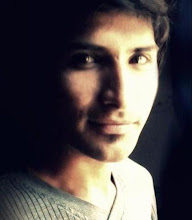
First let’s grab the photos we’ll be using in this tutorial: girl and teddy, which are taken from one of my favorite stock sites 123rf.com. And one balloon photo from sxc.hu.

Step 1

Start by opening the girl image, then grab the Pen Tool (P) and start extracting. When you’re done making the path, right-click and select Make Selection. Then use Command + C to copy the selected area.
While extracting, take a look at the arrows, they indicate shadows. Make sure you don’t include them with the girl. We’re gonna cast shadows on our own depending on the color of the background.

Step 2

Create a new document that is 1200 pixels by 950 pixels, with a of 300 px/inch. Make a new layer and name it "Background." change your Foreground Color to #f0ce46 and Background Color to #f78414. Grab the Gradient Tool (G), then in the upper bar set the gradient option to Radial. Now drag the gradient from the top left corner. Use Command + V to paste our extracted girl. Name this layer "Girl" and go to Image > Adjustments > Selective Color and experiment with the Red and Yellow values. I tried to give the girl some color correction to make her a better fit to this orange environment.
Tip: Your background colors are up to personal taste. I’ll show you the way I did this illustration, but if you choose some other colors (for example blue tones), then you should correct the girl’s color into colder rather than warmer tones.

Step 3

Now grab the Burn Tool (O), then set the Range to Midtones and Exposure to around 30%. Make sure the "Girl" layer is selected, and give some contrast to her hair by painting. And if other spots of her silhouette seem to be little dull, you can apply this process again.

Step 4

OK, we did some nice color and contrast corrections. But it’s still not enough. Now it’s something important because we need to make her look more vivid, and also cast some shadows under her body. I made a fast three-step guide below. Let’s take a look at what we’re going to do with this girl image and how.
First thing we wanna do is cast shadows. So take a look at point 1 below. This is the original image we are using. Zoom into the shadows under the girl, and as you see we have quite easy task. This picture already guided us on how the shadows were originally placed. So what you need to do now is reproduce the same shadow effect (as point 3 illustrates). Use point 1 as the guide for this process.
However, before you do anything, let’s move to the next step.
If you’re using some other picture than mine, and there is no standard shadow in yours, then I recommend seeing one of my plus tutorials with moving mannequins. There are tons of tips in that tutorial on how to place shadows when you have no base.

Step 5

Before we move forward, make new layer above the "Background" layer. Name it "Ground." Change your Foreground Color to #ffe07c, grab the Gradient Tool (G), then in the upper bar set the option to Radial. Drag the gradient to the middle of that screen. Now you should have a big yellow dot. Then go to Edit > Transform > Distort and give this big dot some perspective to make it look like there is ground there (second image below).
Create a new layer below the "Girl" layer. Name it "Shadow." Change the color to something around #8f4121 (brown). Grab the Brush Tool (B), set Hardness to 0%, Flow to around 10%, and keep your Master Diameter quite small. Then start painting under the girl – where the shadows should be. Make the diameter size very dynamic, and change it all the time for various results. Help yourself with the Eraser Tool (E), and set Hardness to 0% and Flow to 50%.
As I pointed in previous step, use the original image to see how the shadows look, and cast them the same way. It doesn’t have to be perfect, give this girl at least a touch of shadow to make it look more realistic. Also, if it’s necessary, change your color to darker and lighter brown. Casting shadows is always a tough part of art, but it pays off well. You need to work with patience.
Remember, every single color depends on the environment. I’m making everything in warm tones, so I mostly mix yellow and orange. As for the shadows, I darkened the yellow tone (which is our ground color) and I turned out with brown. The reason I did this is because every object’s shadow has a touch of color from the ground that it occupies.

Step 6

Now select the "Girl" layer. Go to Image > Adjustments > Levels, and add a little more contrast. Then go to Image > Adjustments > Hue/Saturation and lower the value of Saturation. We don’t want to make this girl too bright though. Next, go to balance the picture and give some nice color depth, duplicate (Command +J) the "Girl" layer, and name it "Color depth." Change this layer’s Blending Mode to Soft Light and then use Image > Adjustments > Gradient Map. Set the gradient from #1b130c to #969696.
Depending on what you want to achieve, your colors in the gradient mapping will be different. I recommend you experiment with these colors. There are many nice results that can be discovered. However, if you have no idea how to take care of gradient map settings, just set it to Black, White and lower the layers opacity just a touch. This always looks good.
The last image below is just a view of how this girl should look (with the background turned off).
Tip: Before you run the gradient map, make sure you changed the layer’s blending mode do Soft Light. Next you will get the final image preview while using the particular gradient.

Step 7

I turned the orange "Background" layer back on, though it needs to be brightened. So, let’s work on that now. We’ll also start working on adding our paths, which will become our malleable colored lines.
Make a new layer above the "Background" layer and name it "Back colors." Change the color to #efd8a5 (a nice bright yellow). Grab the Brush Tool (B), set Hardness to 0%, Flow around 20-40% and make one or several big dots behind this girl. Switch to the Pen Tool (P). Then start creating some nice paths surrounding this girl.
If you’re having some problems with the Pen Tool, you may check out this Comprehensive Guide to Photoshop’s Pen Tool to learn how to properly set the path curves properly.

Step 8

Create a new group above the "Girl" layer. Name it "Blue line" and create there a new layer called "b_line" as well. Then go back to the Brush Tool (B), change the settings to Hardness 100%, Flow 100% and the Master Diameter to 7-10px (depending on how big your image is). Next, go to the brush settings and set the Minimum Roundness to 25%. Then switch to the Pen Tool (P). Right-click and select Stroke Path.
Remember to make sure that the Simulate Pressure option is checked. We will be using this throughout this tutorial with every path stroke (be sure to keep this checked), so I will stop reminding from here forward.
It doesn’t matter what kind of color you stroke this path because we’re going to color it through blending options. So, if you don’t want to get confused, you can use white as the color to stroke this path.
Now press Command + right-click on the "Girl" layer’s thumbnail to load selection. Next, add a Layer Mask to the "b_line" layer, and select this mask. Grab the Brush Tool (B) with the color black selected, set all brush settings up to 100%, to make it hard. Then paint in spots indicated in the second image below. We need to create an effect that the line is surrounding this girl.
Issue: I don’t know what’s the cause of the Brush Options – Minimum Roundness option failure, but sometimes it’s not possible to turn it on. If you receive this problem just simply restart your Photoshop. The next thing to do is to open the brush options and make sure this is set to 25%.

Step 9

Now let’s play around with this line’s Blending Options. The standard blending options settings make everything very flat with an absolute lack of depth. Even though I’ve seen people applying custom settings, they still had problems with avoiding the flat look. So you need to be very accurate with this.
Depending on what color you want to make your line, the layer styles will be different. If you decide to colorize it with blue, you need play around with many various tones of blue.
Also, very important thing is the Gloss Contour in Bevel and Emboss setting (second image below). I customized the Mapping to fit my own needs. If you play around with these anchors you will get the idea how it works. Make sure you have the option Preview checked, then you can apply effects in real time.
Another important thing is the Angle and Altitude of Shading (the option above Gloss Contour – second image below). Spend some time while adjusting this little target. It’s the option that allows you to cast lights properly.

Step 10

Now grab Brush Tool (B), set Hardness to 0% change Master Diameter dynamically between 1px and 2px by making more paths and stroke them the same way. We will make some touch ups to make this blue line complete.
So create new layer above "b_line" name it "b_line fills", and create paths. Make many paths by starting and ending in different points. Looks images below. At 3rd and 4th image, those arrows indicate some spots, where I placed anchors. I did it dynamically setting various points and various brush size from 1px to 2px.
If you are bothered with some unwanted lines, just simply erase them using Eraser Tool (E) of 0% Hardness and 50% Flow.

Step 11

I assume you got the idea of making these fills. So make more lines, apply them to spots of your own choice.
Now let’s take care of coloring these small lines. Basically, I copied layer styles from the "b_line" layer and pasted it to the "b_line fills" layer. Then I entered the "b_line fills" layer Blending Options and just changed the color of Inner Glow to lighter blue #c1dbff. You may also change the Satin color to some other blue tone. I set the #54abbb color for Satin. It didn’t change a lot. The changes are barely visible, but now these fills aren’t just one color.
I didn’t play around with the "b_line fills" layer styles because these lines are very small and all effects would be hard to notice. It’s enough if you just change the color of inner glow (and if you want, for satin also) as said before.

Step 12

Let’s follow the same process as in Step 9. This new line will cross the blue line and we’ll fill it with green tones. So create a new group above the "Blue lines" group, name it "Green line." Create a new layer in it, and name it "g_line." Grab the Brush Tool (B) and change the Master Diameter size to 6-8px, set Hardness and Flow to 100%. Next grab the Pen Tool (P), draw a nice path crossing the blue line, then right-click and select Stroke Path. After this apply the same effects as previously, and play around with Shading in Bevel and Emboss. And this time use green colors for all options.
When your done, grab the Eraser Tool (E) and make sure the "g_line" layer is selected. Then erase some parts where both these lines cross to give some depth. You’re free to make this using a Layer Mask also. Either way is fine.

Step 13

Now, we’re just repeating Steps 10 and 11, but on the green line now. So make a new layer in this "Green line" group, name it "g_line fills." Now grab the Brush Tool (B), set Hardness and Flow to 0%, change Master Diameter dynamically between 1px and 2px and make many paths. Then stroke them. After this, copy the layer styles from "g_line" and paste it to "g_line fills", same way as you did previously.
And you don’t need to brighten the colors of "g_line fills" layer, they already look good. But if you want, make sure you brighten Inner Glow’s color. If you are bothered with some unwanted lines, just simply erase them using the Eraser Tool (E) with Hardness set to 0% and 50% Flow.

Step 14

OK, looking good. Now, we’ll make the next line a little more interesting. So create a new group above all and name it "Pink line." Create a new layer in it and name it "p_ring." Grab the Pen Tool (P) and draw a curvy path around girl’s leg (instead of drawing a path you can use the Ellipse Tool (U) and create a circle instead). Then right-click and select Stroke Path. Next, apply some nice layer styles the same way as previously. You can use my settings or experiment with your own.

Step 15

If your ring needs some touch ups, select the "p_ring" layer, duplicate this layer (Command + J), go to Edit > Transform > Flip Vertical and adjust it to make an ellipse. Then grab the Eraser Tool (E) and erase some parts to make it look like it was surrounding her leg.
When you’re done, select the "p_ring" layer again, duplicate it (Command + J) 3-4 times, and using Edit > Free Transform make those rings fit the girl’s leg.

Step 16

Create a new layer, name it "p_line," grab the Pen Tool (P) and draw a nice curvy path. This will be our third line.
Go to Blending Options and apply same effects as previously. In this case, you need to play around with Bevel and Emboss > Shading. Make sure the Angle and Altitude fit your needs. Depending on what direction your line is going and what kind of shape it has, the shading will be different. You need to adjust it while you start getting something satisfying.

Step 17

This is another process to repeat. Use the same directions as in Steps 10 and 11, but for the pink line. In a shortcut: create a new layer called "p_line fills," draw some paths around the main line using the Pen Tool (P), and stroke them with 1px or 2px soft brush. Next, copy the layer style from the "p_line" layer and paste it to the "p_line fills" layer.

Step 18

Now let’s play around creativity. Select the "p_line fills" layer, then grab the Lasso Tool (L) and draw a selection around some cool looking torn lines (first image below). Then right-click, and select Layer Via Copy. This will copy the piece we selected with its layer styles included. Now right-click on this copied layer and select Convert to Smart Object. After this, make around 4-5 duplicates (Command + J) and spread them around this pink line. Make some rotations using Edit > Free Transform.


The reason we used Convert to Smart Object option, is not to let these pieces pixelize. Since they are smart objects, you are able to resize this piece down and rotate it as many times as you want without losing quality. But don’t resize it up, as it is not a vector object.

Step 19

Go back to the "Blue line" group and apply the same effects as in the previous step. And you can do this to each line that you’ve created. I recommend playing around with colors of these line fills, you may achieve some cool results. Try to make them fit to the lines that they are connected to.

Step 20

Now we’ll create some more great effects. People used to make these kind of shapes with Illustrator, and export them to Photoshop. Well, not everyone knows how to properly use Illustrator, so I’ll show you how to create these shapes in Photoshop. The only disadvantage is that shapes will remain raster objects, but it’s OK, as they’re very easy to recreate.
First create a new group above all, name it "blue drops." Inside this group, create a new layer called "b_drop." Go to the Brushes Palette (Window > Brushes). Select Shape Dynamics and apply the settings shown below. Then make sure your brush is set to 100% Hardness and 100% Flow. In the Brushes Palette select Brush Tip Shape (second image below) and apply the settings again. Make sure that the Spacing is set to 1%. About the Diameter size, it depends how big you want your shapes to look like. But for this tutorial, I recommend following all the settings shown below.
Next, select the Ellipse Tool (U), while holding Shift, draw a circle, around the same size as you see in the third image below. Then select the Pen Tool (P), right-click, and select Stroke Path.

Step 21

Go to "b_drop" layer’s Blending Options and play around with these settings. This is important because standard layer styles give a very flat look. To avoid this make sure your shape has proper colors, highlights and shading.

Step 22

Now that you have created the 3D shape, it’s time to duplicate it (Command + J) a few times and fit to the main blue line. Remember, always have one shape as a backup, so make one of these duplicates invisible (you never know when you may need it). As for the rest of the copies, depending on what you want to do, we’ll leave some shapes as regular objects and turn some of them into smart objects.
In the previous steps, I’ve explained how you can use smart objects. And I used it only in one shape here (layer right-click > Convert to Smart Object) because I searched for a good spot for this shape and I rotated (Edit > Transform > Rotate) it many times. As for the rest rest of the objects, I didn’t convert them into smart objects, because I wanted them to retain their layer styles. And as you resize down these normal objects, the layer styles stay untouched, and they stay connected. You can see in the image below that the small shapes are darker. For example, the Inner Glow has the same value, but the object got smaller.
And the point of all this is that you need to rotate these shapes to make them look like they where in motion, while dropping little pieces. It’s good to make each one look different then the others.

Step 23

As you remember, we named this layer "b_drop" (the b letter stands for blue). And I mentioned that you’re supposed to backup one "b_drop" layer. So make a copy of this untouched layer and rename it "g_drop." Create a new group, name it "green drops" and drag the "g_drop" layer into this group. Then change this layer’s Blending Options. Set all the colors for various green tones. Also, play around with Bevel and Emboss > Shading (second image below).
Then repeat the same process as the previous step. Make a few duplicates (Command + J) of this green drop and make them look dynamic (use Edit > Transform > Rotate).

Step 24

Same thing here. As we made three lines, and each in different colors, we need to make their drops in pretty much the same colors. So repeat the previous steps of creating drops and apply this technique creating now pink drops.
You always need to find the right colors. Start experimenting with them, and you will see which setting in Blending Options is more important then the other. Try to spend as much time as you need to get this right.

Step 25

After you’re done with all the lines and drops it’s time to touch up the background. Simply grab the Brush Tool (B), set the Master Diameter to a fairly large brush, change the Hardness to 0%, and Flow to around 12-15%. Create a new layer above the "Background" layer and name it "background color." Change your colors as shown below, and just paint.
Apply a very light brushing, the Flow option reacts to pressure. If you brush in one place too much, the color will be more intensive, so brush with single light clicks. Don’t hold the mouse button as you brush.
Tip: you can make each color on a new layer and then play around with their opacities.

Step 26

OK, the background looks fantastic, it’s deep and balanced. Now we can move further. Open the balloonimage, and extract it using the Magic Wand Tool (W). We can use this tool, as this balloon is easy extractable. It was probably cut out before and saved on the white background. Place it into your main project, resize it down and flip it horizontally (use Edit > Transform to do this). Rename it to "green balloon" and apply some color adjustments. You can find them under:
  • Image > Adjustments > Hue/Saturation
  • Image > Adjustments > Brightness/Contrast
  • Image > Adjustments > Selective Color
  • Image > Adjustments > Levels

Step 27

Drag the "red balloon" to our main project again, and make a duplicate of it (Command + J). Name the first "pink balloon" and the second "blue balloon." For the "pink balloon" use only Image > Adjustments > Hue/Saturation because it’s red, and we want to get something in between purple and pink. For the "blue balloon" use:
  • Image > Adjustments > Hue/Saturation
  • Image > Adjustments > Selective Color
  • Image > Adjustments > Brightness/Contrast

Step 28

Now bring back the brush settings from Step 8. Create two new layers, then name them "blue rope" and "green rope." Next, draw some curvy paths on each layer below the balloon. Make sure your brush size is 1px big and it’s 100% Flow. Right-click and select Stroke Path. Use blue and green colors to stroke the paths. You can also copy the layer styles from previous lines/drops and paste them into these rope line layer styles.

Step 29

Now, this is my favorite part of the tutorial. You probably will enjoy this too. Create a new group above the "Background" layer, name it "Effects" and work in this group now. Grab the Custom Shape Tool (U), set its options to Shape Layers, and pick a shape of your own choice (the settings are shown in the first image below).
Find some empty spot on our illustration and work there. Create this path (you can hold Shift to get a perfect shape). It should automatically be filled with your Foreground Color, which can be white. Name this layer "Orange," the go to Blending Options and apply some nice effects to it.
I tried to get some tones of orange color, from brown to yellow. And it doesn’t really matter where the shading is. The only thing you need is to have some nice one-color variety here (using different tones).

Step 30

Now we have a nice vector shape, and it’s editable. Go to Edit > Transform > Warp, then bend and twist this shape to get a satisfying result. I simply love this step, you can be very creative with these shapes. After each transform hit enter and go again with Edit > Transform > Warp.
The whole bending below is done this way, warp / enter / warp / enter, and so on, to achieve better results. The best thing about this is that this shape remains vector, even though it’s getting bent to the max.

Step 31

What we came up with here is an awesome shape (still vector!), and we can now position it everywhere. While repeating thing process, we can cover the whole back of this girl using various shapes. Now, using this technique make more shapes like this, then place them behind this girl and make them fit. Use the Copy/Paste Layer Styles option every time you make a new shape. Do not adjust each one manually because you’re gonna waste time.
Here is something you need to remember: although this is vector, it may get sharpen sometimes. If you twist this shape so much to get a very thin line, some jagged edges may occur. So be aware, if you receive something like this, start again with a new shape. Or you can rasterize the vector object (right-click on the layer, select Rasterize Layer). Next, use the Eraser Tool (E) with the Hardness of 0% and Flow of 80-100% to erase some bad looking spots.

Step 32

That’s all for the small shapes. Now, let’s take care for the bigger lines. I used the same technique to create the line that you see in first image below. Next, I rasterize this layer (right-click and Rasterize Layer), and the using Eraser Tool (E), I erased some spots. There is a small case study in images below:
  • In second image below, I made this line fit the back of balloon.
  • In third image below, I created a new shape using the same technique.
In the next images, I just duplicated (Command + J) this curvy line. I rasterized the layer when needed (layer right-click > Rasterize Layer), and used the Eraser Tool (E). To place these lines use Edit > Transform > Rotate. The whole process of positioning these lines took me around 30 minutes because I changed this like ten times. So don’t give up, the more effort you put in this, the better it will look.

Step 33

OK, now just simply repeat Steps 29, 30, and 31, but in green. Using the same technique, create several green shapes and place them behind this girl and mix them with orange shapes.

Step 34

At this moment I thought, I would show you something cool. As you have created some thin, green shapes like you see in the first image below, use Edit > Transform > Warp again. Now try to stretch it to create a nice curve (second image below).
Now go to Edit > Transform, and rotate this shape to make it fit some parts of the green line (third image below). Run Edit > Transform > Warp again and perfectly adjust it with the line. After this you can right-click on this layer, select Rasterize Layer, grab the Eraser Tool (E) and erase some unwanted parts.
Also, if some edges got jagged, use the Smudge Tool (R) with a Strength of 12%. Now smudge the edges towards the line (you can see it in the 5-6 images below).

Step 35

OK, now let’s do some final touch ups. Grab the Brush Tool (B), set Hardness to 0% and Flow to around 10%. Change your Foreground Color to #481e39, create a new layer above the "pink balloon" layer and name it "p_drop shadow." Then start painting below this drop to create a nice touch of shadow.
Next, select the layer of this drop (that is shown in images below) use Command + J to duplicate it. Work with this copy now. Take a look at the third image below: in Blending Options change the size of Inner Glow for the drop copy. Next lower its Opacity and place it below the "p_drop shadow" layer to create a reflection.

Step 36

To give this illustration some meaning I decided to put here some funny thing like this Teddy. I thought, there’s a little girl, lots of colors, so let’s give it a touch of cuteness.
So, cut the bear out of its original image using the Pen Tool (P). Drag it to our main project document. Name this layer "Teddy" and place it above all the layers. Now let’s do some color adjustments using Image > Adjustments > Hue/Saturation and then Image > Adjustments > Levels.
Duplicate the "Teddy" layer using Command + J and select this copy now. Change its Blending Options to Soft Light. Go to Image > Adjustments > Black and White, and give this teddy some nice deep colors and a touch of contrast.
I still thought this teddy needs some more color. So I held down Command and left-clicked on the "Teddy" layer’s thumbnail to bring the selection. Then I created a new layer above all layers. Changed its Blending Mode to Overlay. Next, I set my Foreground Color to #fbc83a, grabbed a Brush Tool (B) with a very soft brush and painted inside this selection just a little.

Step 37

As you still have this selection on, hit Command + Shift + C (copy merged) and then press two times Command + V (paste). Place these teddies the way you see in the first image below. Next, take one of them and place behind the "Green balloon," and make his arm look like a leg.
Now create a reflection with the second teddy. So select another copy of teddy and go to Edit > Transform > Distort and make this bear more flat (second image below). Place it below the original "Teddy" layer to make it look like a reflection. If you get some outgoing edges of this reflection – erase them using the Eraser Tool (E). Apply the same technique to make a reflection of his leg (as you can see in fourth image below).
Next, bring the selection of the "Green balloon" layer (hold Command and left-click on the "Green balloon" layer’s thumbnail). Now create a new layer below the "Teddy" layer and change your Foreground Color to #212b04. Grab the Brush Tool (B), make the brush settings very soft with Hardness 0%, Flow 10-15%, and paint under teddy to create some shadow. Hit Command + D to deselect selection.

Step 38

So we are heading to the end. Hit Command + A to select the whole canvas, then press Command + Shift + C (copy merged). Go to the top of the Layers Palette and hit Command + V to paste this whole piece. Name this layer "final colored" and set it’s Blending Mode to "Soft Light." Now go to Image > Adjustments > Gradient Map, and find some nice satisfying colors to balance this illustration. There are my colors written below. I added them and lowered the Opacity of this layer just a touch.

Conclusion

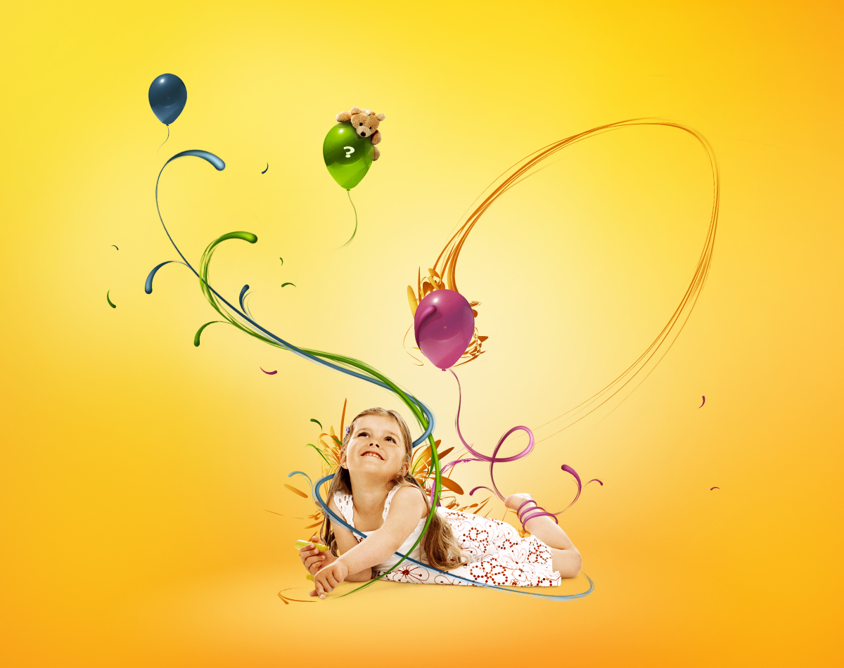
So here it is, the cool colorful illustration covered with lines and shapes. You have to be very careful while creating your own colorful piece. The colors are something that separates good art from weak art. When you understand how it works, all your designs will start to look professional. Always remember to keep the overall balance. Everything needs its own place in a quality illustration. Also, don’t forget about the shading. Objects look good when they are based on reality.
Thanks for reading the tutorial. You can view the final image below or view a larger version here.

Popular Posts

About Me

My photo
I create this Blog for learn the all kind of tutorial about web developing | HTML, Java, PHP, Graphic designing, Corel Draw, Photoshop, Micromedia Flash, Swish and many more related software and internet programming tutorials.

Followers

Blog Archive