CSS Coding
0
comments
Mastering CSS Coding: Getting Started
CSS has become the standard for building websites in today’s industry. Whether you are a hardcore developer or designer, you should be familiar with it. CSS is the bridge between programming and design, and any Web professional must have some general knowledge of it. If you are getting your feet wet with CSS, this is the perfect time to fire up your favorite text editor and follow along in this tutorial as we cover the most common and practical uses of CSS.
Overview: What We Will Cover Today
We’ll start with what you could call the fundamental properties and capabilities of CSS, ones that we commonly use to build CSS-based websites:
- Padding vs. margin
- Floats
- Center alignment
- Ordered vs. unordered lists
- Styling headings
- Overflow
- Position
Once you are comfortable with the basics, we will kick it up a notch
with some neat tricks to build your CSS website from scratch and make
some enhancements to it.
- Background images
- Image enhancement
- PSD to XHTML
1. Padding vs. Margin
Most beginners get padding and margins mixed up and use them incorrectly. Practices such as using the
height
to create padding or margins also lead to bugs and inconsistencies.
Understanding padding and margins is fundamental to using CSS.What Is Padding and Margin?
Padding is the inner space of an element, and margin is the outer space of an element.
The difference becomes clear once you apply backgrounds and borders
to an element. Unlike padding, margins are not covered by either the
background or border because they are the space outside of the actual
element.
Take a look at the visual below:


Margin and padding values are set clockwise, starting from the top.
Practical example: Here is an
<h2>
heading between two paragraphs. As you can see, the margin creates
white space between the paragraphs, and the padding (where you see the
background gray color) gives it some breathing room.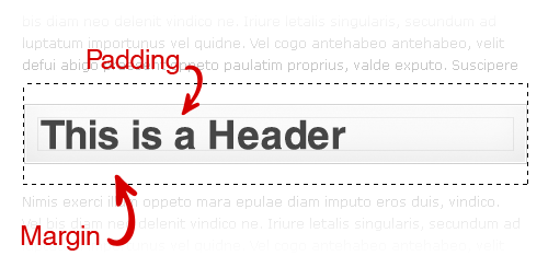
Margin and Padding Values
In the above example of the heading, the values for the margin and padding would be:
margin: 15px 0 15px 0;
padding: 15px 15px 15px 15px;
To optimize this line of code further, we use an optimization technique called “shorthand,” which cuts down on repetitive code. Applying the shorthand technique would slim the code down to this:
margin: 15px 0; /*--top and bottom = 15px | right and left = 0 --*/
padding: 15px; /*--top, right, bottom and left = 15px --*/
Here is what the complete CSS would look like for this heading:
h2 {
background: #f0f0f0;
border: 1px solid #ddd;
margin: 15px 0;
padding: 15px;
}
| | |
Quick Tip
Keep in mind that padding adds to the total width of
your element. For example, if you had specified that the element should
be 100 pixels wide, and you had a left and right padding of 10 pixels,
then you would end up with 120 pixels in total.
100px (content) + 10px (left padding) + 10px (right padding) = 120px (total width of element)
Margin, however, expands the box model but does not directly affect
the element itself. This tip is especially handy when lining up columns
in a layout!
Additional resources:
- Box Model
- Margins and Padding
- The Definitive Guide to Using Negative Margins
- CSS Shorthand Guide
- CSS Margin
- CSS Padding

2. Floats
Floats are a fundamental element in building CSS-based websites and
can be used to align images and build layouts and columns. If you recall
how to align elements left and right in HTML, floating works in a
similar way.
According to HTML Dog, the
float
property “specifies whether a fixed-width box should float, shifting it
to the right or left, with surrounding content flowing around it.”
The
float: left value aligns elements to the left and can
also be used as a solid container to create layouts and columns. Let’s
look at a practical situation in which you can use float: left.
The
float: right value aligns elements to the right, with surrounding elements flowing to the left.
Quick tip: Because block elements typically span 100% of their parent container’s width, floating an element to the right
knocks it down to the next line. This also applies to plain text that
runs next to it because the floated element cannot squeeze in the same
line.

You can correct this issue in one of two ways:
- Reverse the order of the HTML markup so that you call the floated element first, and the neighboring element second.

- Specify an exact width for the neighboring element so that when the two elements sit side by side, their combined width is less than or equal to the width of their parent container.

Internet Explorer 6 (IE6) has been known to double a floated element’s margin. So, what you originally specified as a 5-pixel margin becomes 10 pixels in IE6.

A simple trick to get around this bug is to add
display: inline to your floated element, like so:.floated_element {
float: left;
width: 200px;
margin: 5px;
display: inline; /*--IE6 workaround--*/
}
Additional resources:
3. Center Alignment
The days of using the
<center> HTML tag are long gone. Let’s look at the various ways of center-aligning an element.Horizontal Alignment
You can horizontally align text elements using the
text-align property. This is quite simple to do, but keep in mind when center-aligning inline elements that you must add display: block. This allows the browser to determine the boundaries on which to base its alignment of your element..center {
text-align: center;
display: block; /*--For inline elements only--*/
}
To horizontally align non-textual elements, use the
margin property.
The W3C says, “If both
margin-left and margin-right are auto, their used values are equal. This horizontally centers the element with respect to the edges of the containing block.”
Horizontal alignment can be achieved, then, by setting the left and right margins to
auto.
This is an ideal method of horizontally aligning non-text-based
elements; for example, layouts and images. But when center-aligning a
layout or element without a specified width, you must specify a width in
order for this to work.
To center-align a layout:
.layout_container {
margin: 0 auto;
width: 960px;
}
To center-align an image:
img.center {
margin: 0 auto;
display: block; /*--Since IMG is an inline element--*/
}
Vertical Alignment
You can vertically align text-based elements using the
line-height
property, which specifies the amount of vertical space between lines of
text. This is ideal for vertically aligning headings and other
text-based elements. Simply match the line-height with the height of the element.
h1 {
font-size: 3em;
height: 100px;
line-height: 100px;
}
To vertically align non-textual elements, use absolute positioning.
The trick with this technique is that you must specify the exact height and width of the centered element.
With the
position: absolute property, an element is positioned according to its base position (0,0:
the top-left corner). In the image below, the red point indicates the
0,0 base of the element, before a negative margin is applied.
By applying negative top and left margins, we can now perfectly align this element both vertically and horizontally.

Here is the complete CSS for horizontal and vertical alignment:
.vertical {
width: 600px; /*--Specify Width--*/
height: 300px; /*--Specify Height--*/
position: absolute; /*--Set positioning to absolute--*/
top: 50%; /*--Set top coordinate to 50%--*/
left: 50%; /*--Set left coordinate to 50%--*/
margin: -150px 0 0 -300px; /*--Set negative top/left margin--*/
}
Related articles:
- Vertical Centering With CSS
- Centering Things
- CSS Centering 101
- CSS Centering: Fun for All!
- Two Simple Ways to Vertically Align with CSS
Categories: